
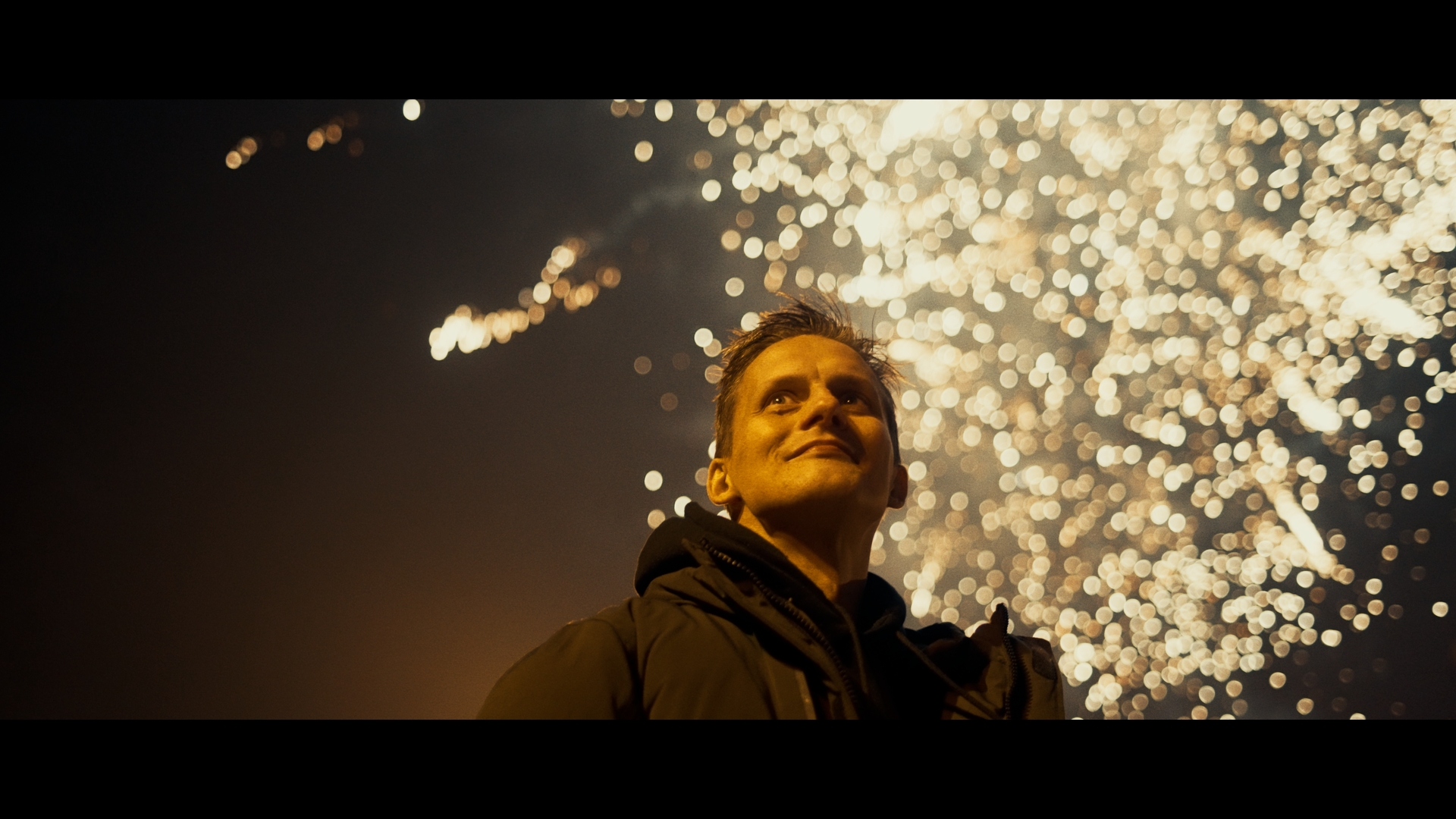
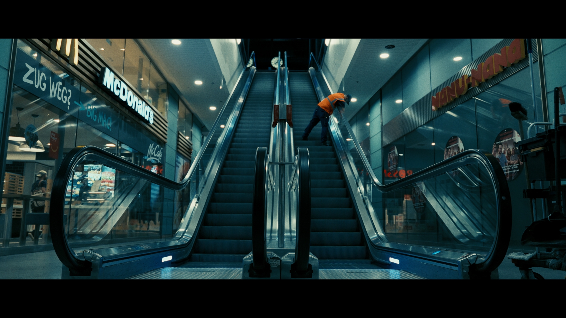
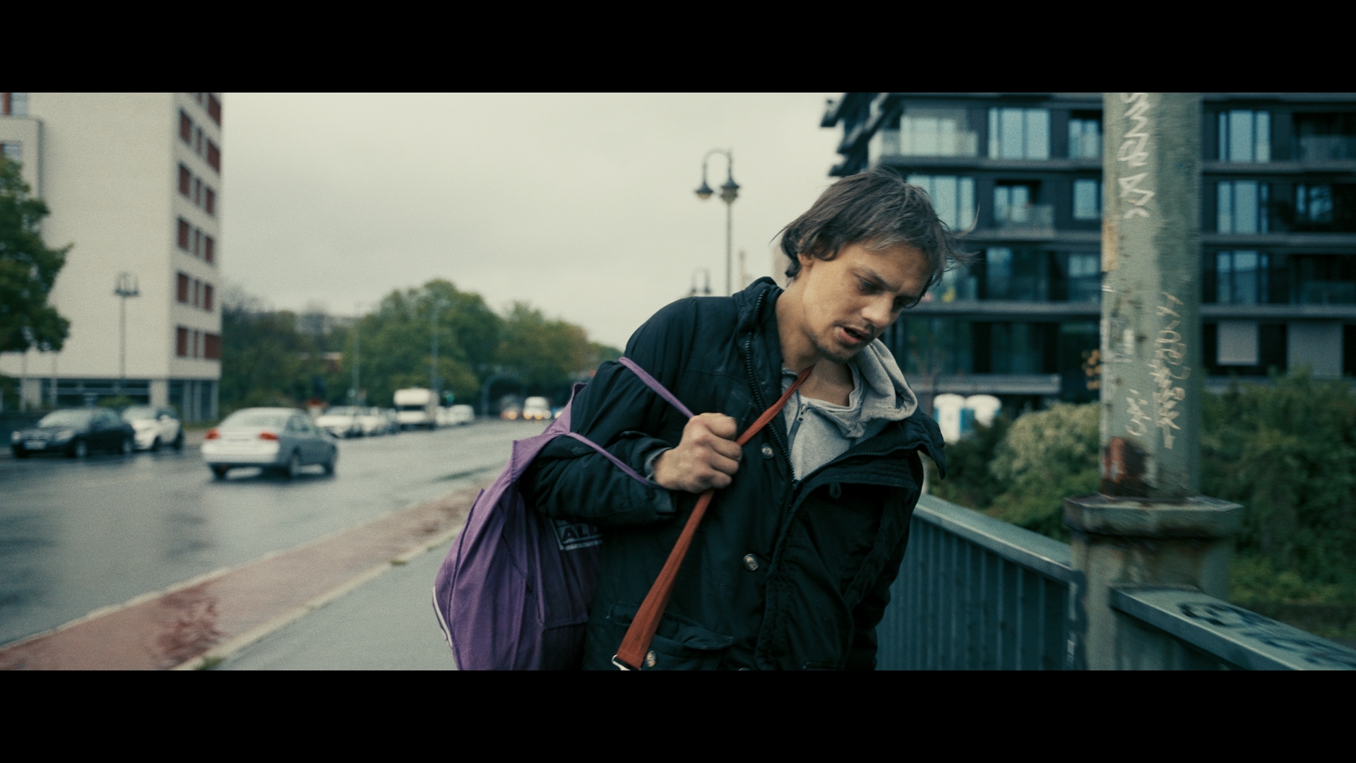
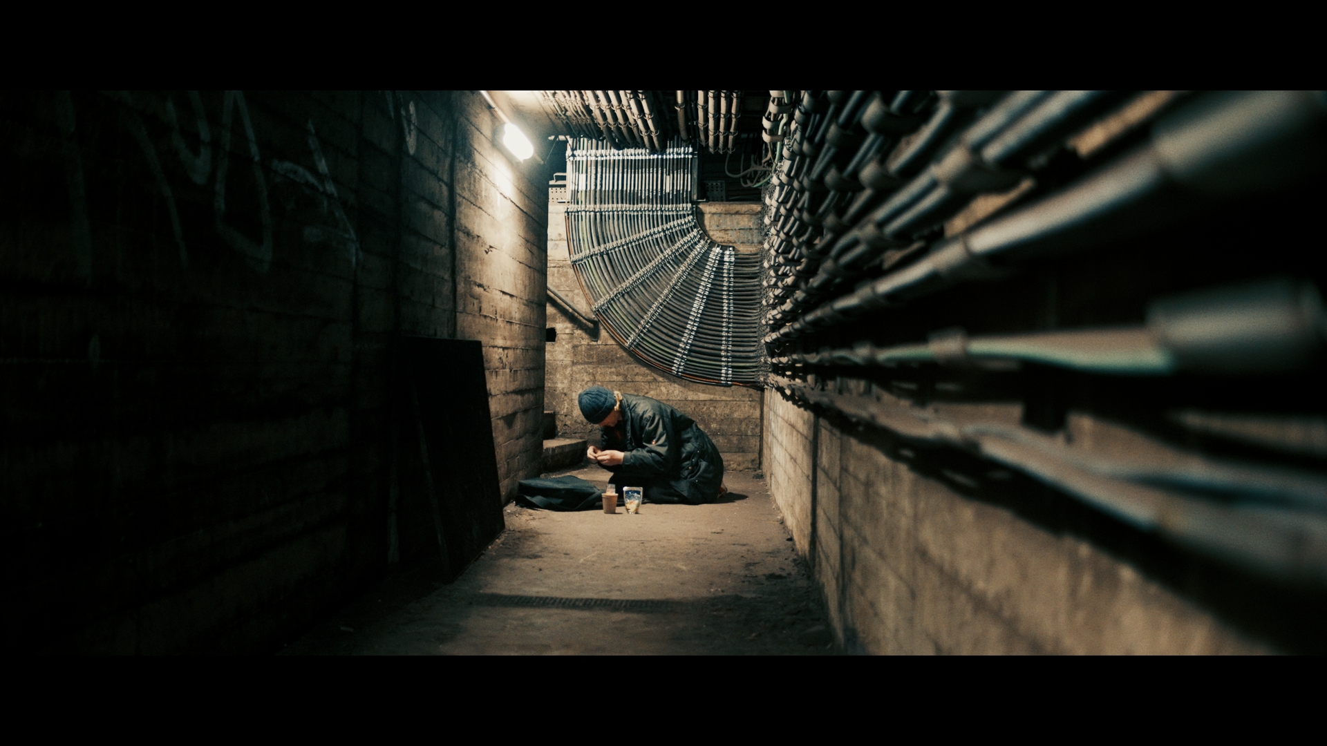
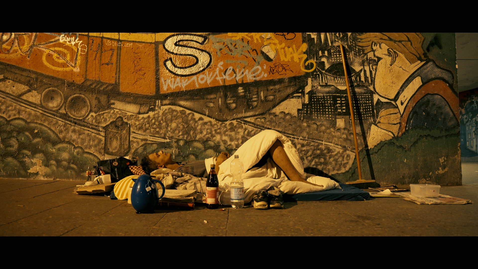
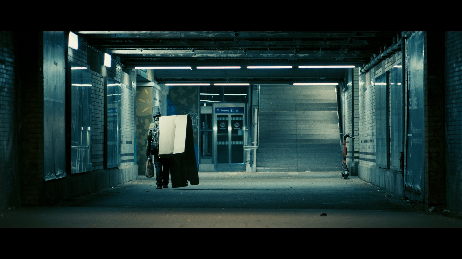
In developing the look for this film, DP Stephan M. Vogt wanted to be bold with the color direction. We worked towards sculpting an overall atmosphere that placed this documentary in a more cinematic direction, usually reserved for fiction films. The aim of the color work was to envelop the audience in the world of the protagonists, and offer a tangible psychological connection to the different spaces portrayed in the film.
Reference images used as inspiration that were crafted into a single cohesive look to support the storytelling.
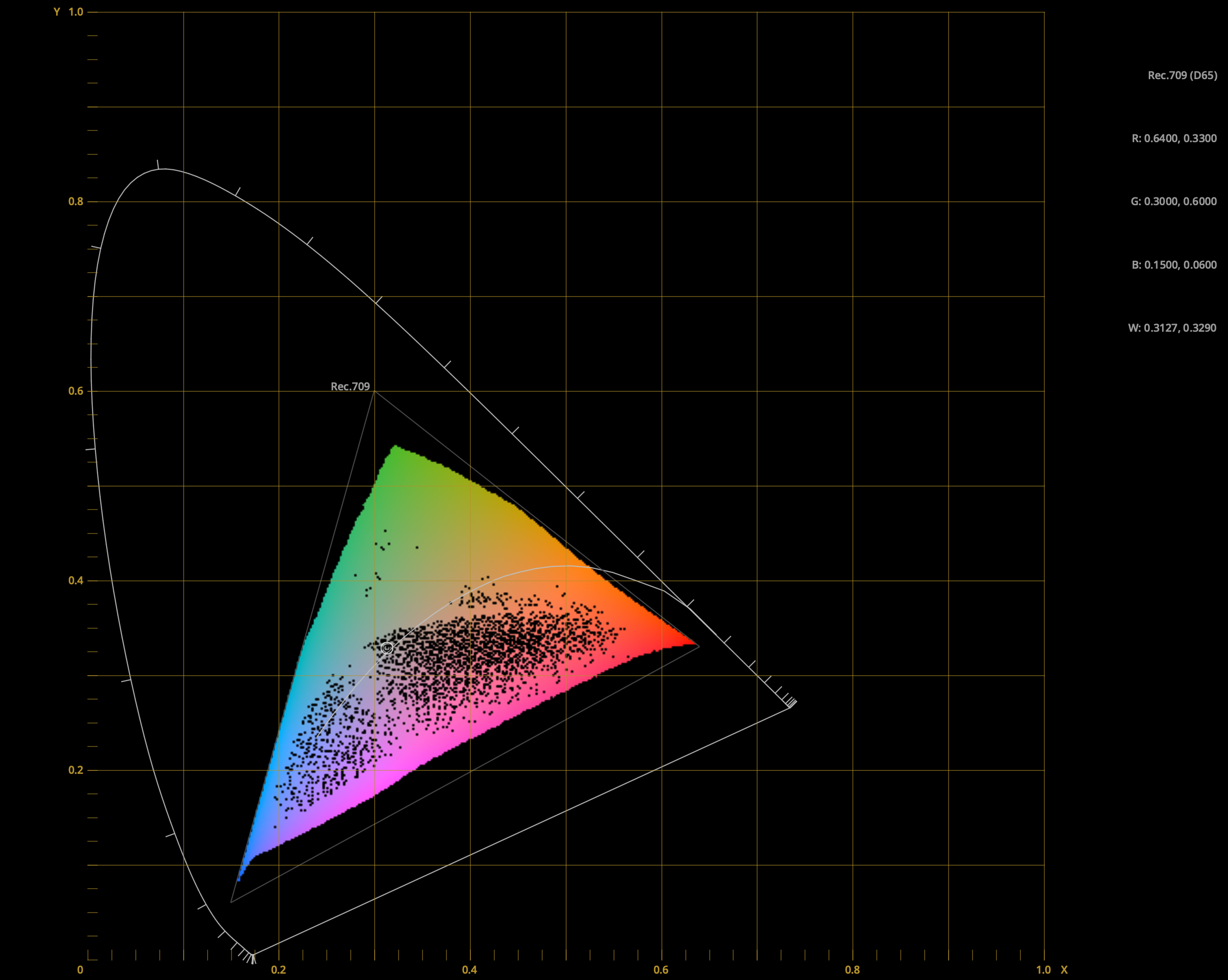
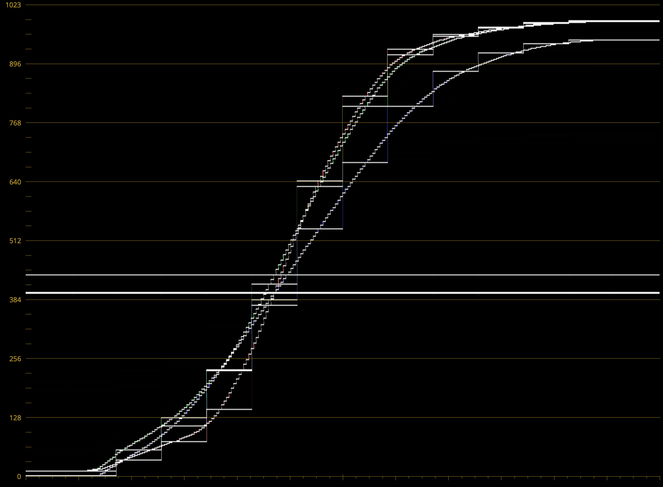
The Show LUT used as a grading base was crafted under the DP’s direction following his 2.5-year shoot. Through multiple iterations, we developed a variation of the traditional film curve, incorporating cool shadows and warm highlights. We reduced overall color saturation, highlighting a distinct yellow hue paired with subtly skewed complementary greens and blues. In sculpting the shadows, the aim was to evoke the tangible feeling of the city’s cold, damp corners. This quality, combined with gently rolled-off highlights to create a blooming, filmic softness, defines the film’s distinctive 'inky' contrast aesthetic.